Royal Automobile Club

ALLT-A-BHAINNE

WHISKY FOR NON-CONFORMISTS | PRINT DESIGN

Our challenge

Oval Partnership is a specialist recruitment service for the drinks industry. Our challenge was to design a focused campaign identity to launch them into this new sector.

Recruitment services messaging tends to be predictable. Our approach was to go against the grain with a playful, light-hearted look and feel.

An integrated creative approach that reconnects nature and industry into everyday environments in truly special ways.

Our solution

Bold, crafted messaging combined with bespoke, playful imagery highlights the friendliness of Oval Partnership, the personal relationship between recruiter and candidate and the excitement of finding a new role.

The die cut detail on the front cover introducing the ostrich poking through furthers this light-hearted sensibility.

Our solution

Brewdog

ALLT-A-BHAINNE

WHISKY FOR NON-CONFORMISTS | PRINT DESIGN

Our challenge

Oval Partnership is a specialist recruitment service for the drinks industry. Our challenge was to design a focused campaign identity to launch them into this new sector.

Recruitment services messaging tends to be predictable. Our approach was to go against the grain with a playful, light-hearted look and feel.

An integrated creative approach that reconnects nature and industry into everyday environments in truly special ways.

Our solution

Bold, crafted messaging combined with bespoke, playful imagery highlights the friendliness of Oval Partnership, the personal relationship between recruiter and candidate and the excitement of finding a new role.

The die cut detail on the front cover introducing the ostrich poking through furthers this light-hearted sensibility.

Our solution

Oval Partnership

ALLT-A-BHAINNE

WHISKY FOR NON-CONFORMISTS | PRINT DESIGN

Our challenge

Oval Partnership is a specialist recruitment service for the drinks industry. Our challenge was to design a focused campaign identity to launch them into this new sector.

Recruitment services messaging tends to be predictable. Our approach was to go against the grain with a playful, light-hearted look and feel.

An integrated creative approach that reconnects nature and industry into everyday environments in truly special ways.

Our solution

Bold, crafted messaging combined with bespoke, playful imagery highlights the friendliness of Oval Partnership, the personal relationship between recruiter and candidate and the excitement of finding a new role.

The die cut detail on the front cover introducing the ostrich poking through furthers this light-hearted sensibility.

Our solution

Drake and Morgan Corporate Affairs

ALLT-A-BHAINNE

WHISKY FOR NON-CONFORMISTS | PRINT DESIGN

Our challenge

Meridian Water is Enfield Council’s £6bn regeneration programme. We were tasked with the design and content strategy for the Placebook Vision and Principles masterplan communication. From branding to compelling executive summary brochures designed to motivate their development partners, cabinet ministers as well as Network Rail and GLA collaborators.

Our role was to help enthuse and encourage investment with a communication platform that was driven by the creation of a thriving new economy at the Lee Valley and our creative did indeed reflect that energy and momentum.

An integrated creative approach that reconnects nature and industry into everyday environments in truly special ways.

Our solution

Our designs were inspired by the Lee River and the beautiful regional valley parklands. The graphic devices that run through the editorial and brand positioning explorations all celebrate ‘parklife on your doorstep’. The creative concepts together with CGI drawings, maps and landscape architectural visuals communicated the animated streets, buildings and light industrial hubs that will become a vibrant mixed-use environment, liveable places to be enjoyed by everyone regardless of ability, income, age and cultural background.

Our solution

RECRUITMENT & HR STRATEGY

ALLT-A-BHAINNE

WHISKY FOR NON-CONFORMISTS | PRINT DESIGN

Our challenge

Meridian Water is Enfield Council’s £6bn regeneration programme. We were tasked with the design and content strategy for the Placebook Vision and Principles masterplan communication. From branding to compelling executive summary brochures designed to motivate their development partners, cabinet ministers as well as Network Rail and GLA collaborators.

Our role was to help enthuse and encourage investment with a communication platform that was driven by the creation of a thriving new economy at the Lee Valley and our creative did indeed reflect that energy and momentum.

An integrated creative approach that reconnects nature and industry into everyday environments in truly special ways.

Our solution

Our designs were inspired by the Lee River and the beautiful regional valley parklands. The graphic devices that run through the editorial and brand positioning explorations all celebrate ‘parklife on your doorstep’. The creative concepts together with CGI drawings, maps and landscape architectural visuals communicated the animated streets, buildings and light industrial hubs that will become a vibrant mixed-use environment, liveable places to be enjoyed by everyone regardless of ability, income, age and cultural background.

Our solution

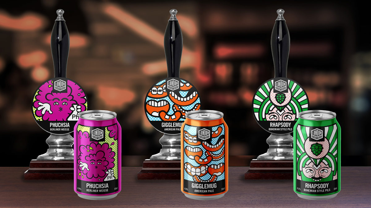
London Brewing Company | Brand Identity and Beer Range Design

ALLT-A-BHAINNE

WHISKY FOR NON-CONFORMISTS | PRINT DESIGN

Our challenge

Meridian Water is Enfield Council’s £6bn regeneration programme. We were tasked with the design and content strategy for the Placebook Vision and Principles masterplan communication. From branding to compelling executive summary brochures designed to motivate their development partners, cabinet ministers as well as Network Rail and GLA collaborators.

Our role was to help enthuse and encourage investment with a communication platform that was driven by the creation of a thriving new economy at the Lee Valley and our creative did indeed reflect that energy and momentum.

An integrated creative approach that reconnects nature and industry into everyday environments in truly special ways.

Our solution

Our designs were inspired by the Lee River and the beautiful regional valley parklands. The graphic devices that run through the editorial and brand positioning explorations all celebrate ‘parklife on your doorstep’. The creative concepts together with CGI drawings, maps and landscape architectural visuals communicated the animated streets, buildings and light industrial hubs that will become a vibrant mixed-use environment, liveable places to be enjoyed by everyone regardless of ability, income, age and cultural background.

Our solution

MERIDIAN WATER | BRANDING & STAKEHOLDER DOCUMENT

ALLT-A-BHAINNE

WHISKY FOR NON-CONFORMISTS | PRINT DESIGN

Our challenge

Meridian Water is Enfield Council’s £6bn regeneration programme. We were tasked with the design and content strategy for the Placebook Vision and Principles masterplan communication. From branding to compelling executive summary brochures designed to motivate their development partners, cabinet ministers as well as Network Rail and GLA collaborators.

Our role was to help enthuse and encourage investment with a communication platform that was driven by the creation of a thriving new economy at the Lee Valley and our creative did indeed reflect that energy and momentum.

An integrated creative approach that reconnects nature and industry into everyday environments in truly special ways.

Our solution

Our designs were inspired by the Lee River and the beautiful regional valley parklands. The graphic devices that run through the editorial and brand positioning explorations all celebrate ‘parklife on your doorstep’. The creative concepts together with CGI drawings, maps and landscape architectural visuals communicated the animated streets, buildings and light industrial hubs that will become a vibrant mixed-use environment, liveable places to be enjoyed by everyone regardless of ability, income, age and cultural background.

Our solution

Searcy’s The Gherkin

Searcy’s The Gherkin

EDITORIAL AND DESIGN

Our challenge

With wedding venues in high demand and brides spoilt for choice we were tasked to refresh Searcys wedding offer on 30 Pavilion Road set in a beautiful Georgian townhouse.
Walking in the footsteps of royalty and Hollywood icons in the heart of Knightsbridge this elegant venue with its private dining room, bedrooms and roof terrace guarantees the most memorable of all society weddings.

Charm them, enchant them, open their eyes to the many inspiring possibilities, whether it’s the ultimate wedding or a quick, pop-in for a chat meeting.

Our solution

Our brand positioning work started with the creation of a bank of verbal assets to reach their brand advocates,
lapsed users and new prospects throughout the year and across all print and digital touchpoints.
We then designed print and digital to help bring the building to life, engaging and drawing readers
into a journey of discovery, and creating an array of exciting reasons to visit or host a party at the house.

Allt-A-Bhainne | WHISKY FOR NON-CONFORMISTS | PRINT DESIGN

ALLT-A-BHAINNE

WHISKY FOR NON-CONFORMISTS | PRINT DESIGN

Our challenge

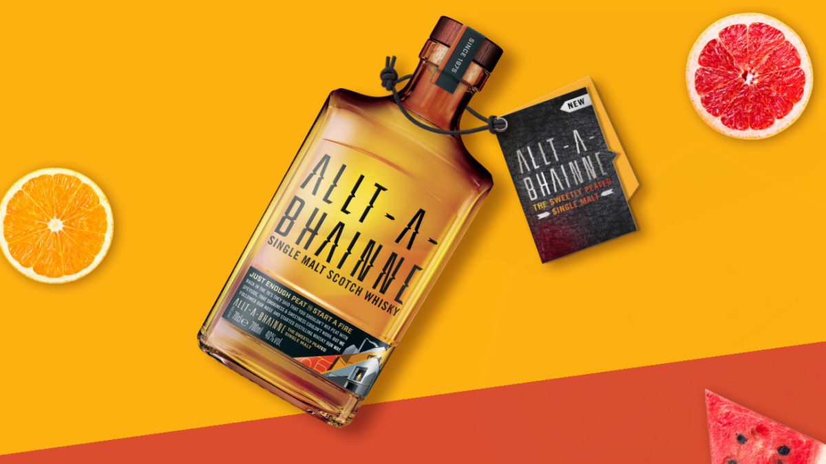
The new single malt from Chivas Brothers arrived on shelves unbound by convention and with a fierce determination to shake up the single malt market with its bold brand attitude.

The category goals were to challenge stereotypes, and to introduce whisky into less formal drinking occasions. Our design challenge was to create a neck tag that matched the brand’s ambitions and captured the spirit of the whisky.

Speyside is known for its fruity whiskies but Allt-A-Bhainne goes against the grain to bring peat to the rugged mountain ranges, creating a unique single malt whisky with an unconventional flavour.

Our solution

The concept had to be an eye-catching design that communicated the founders’ vision. Born in the 70’s, this new single malt was never going to be your typical whisky: it would be proud to stand out from the crowd, a walk on the wild side, rather than a dram by the fireside.

This whisky is liberated and disruptive. That’s what makes it different. We chose angular detailing and unique edges, which, combined with textured boards, reflected the peat and smokiness of the brand. The finished product: a design solution with plenty of shelf shout!